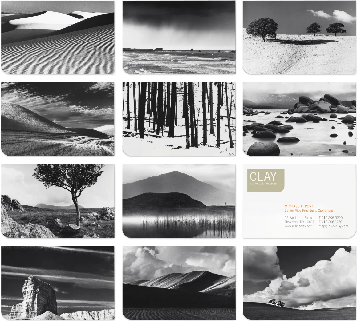
Mimi O Chun

CLAY

Visual ID, Marketing

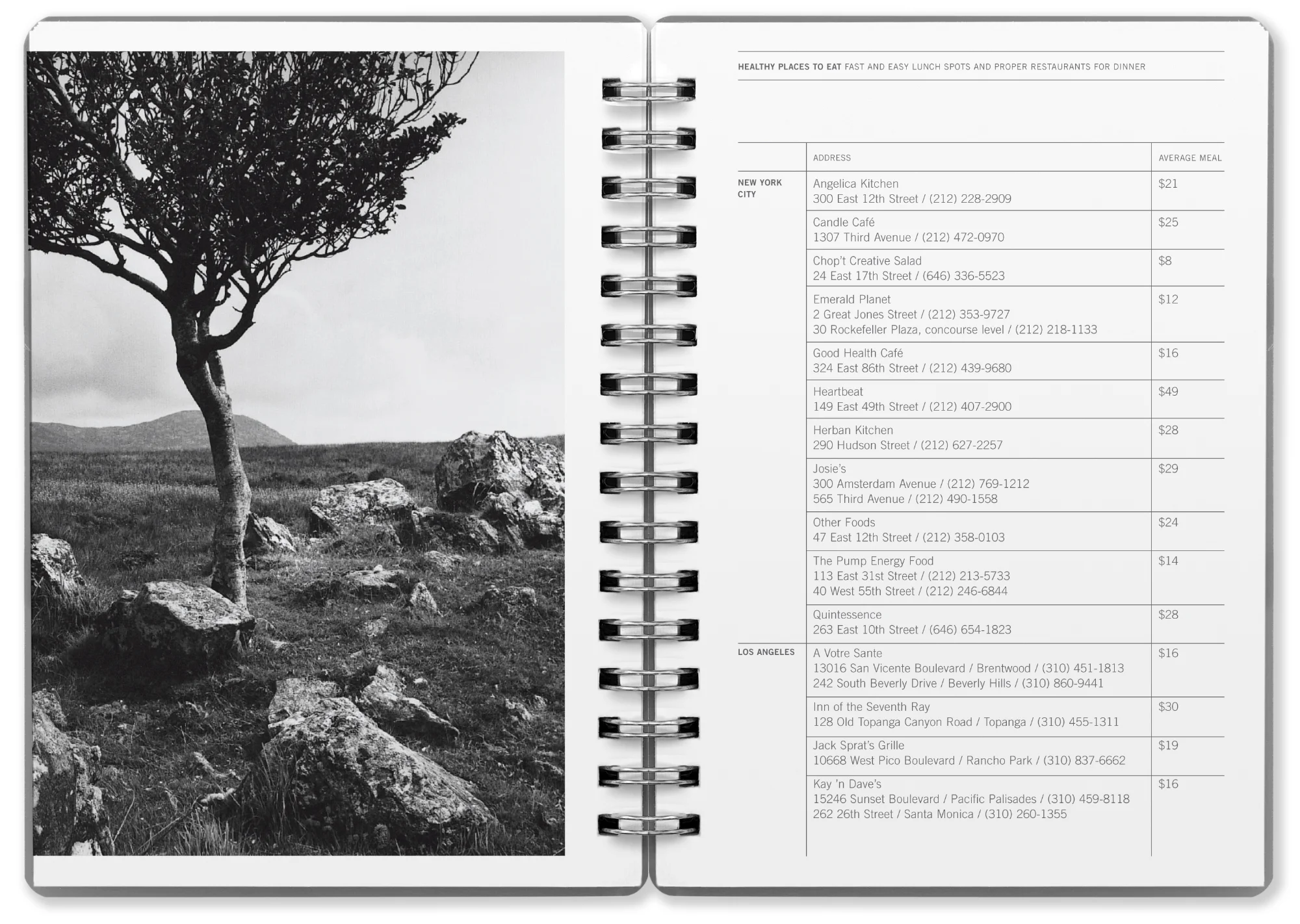
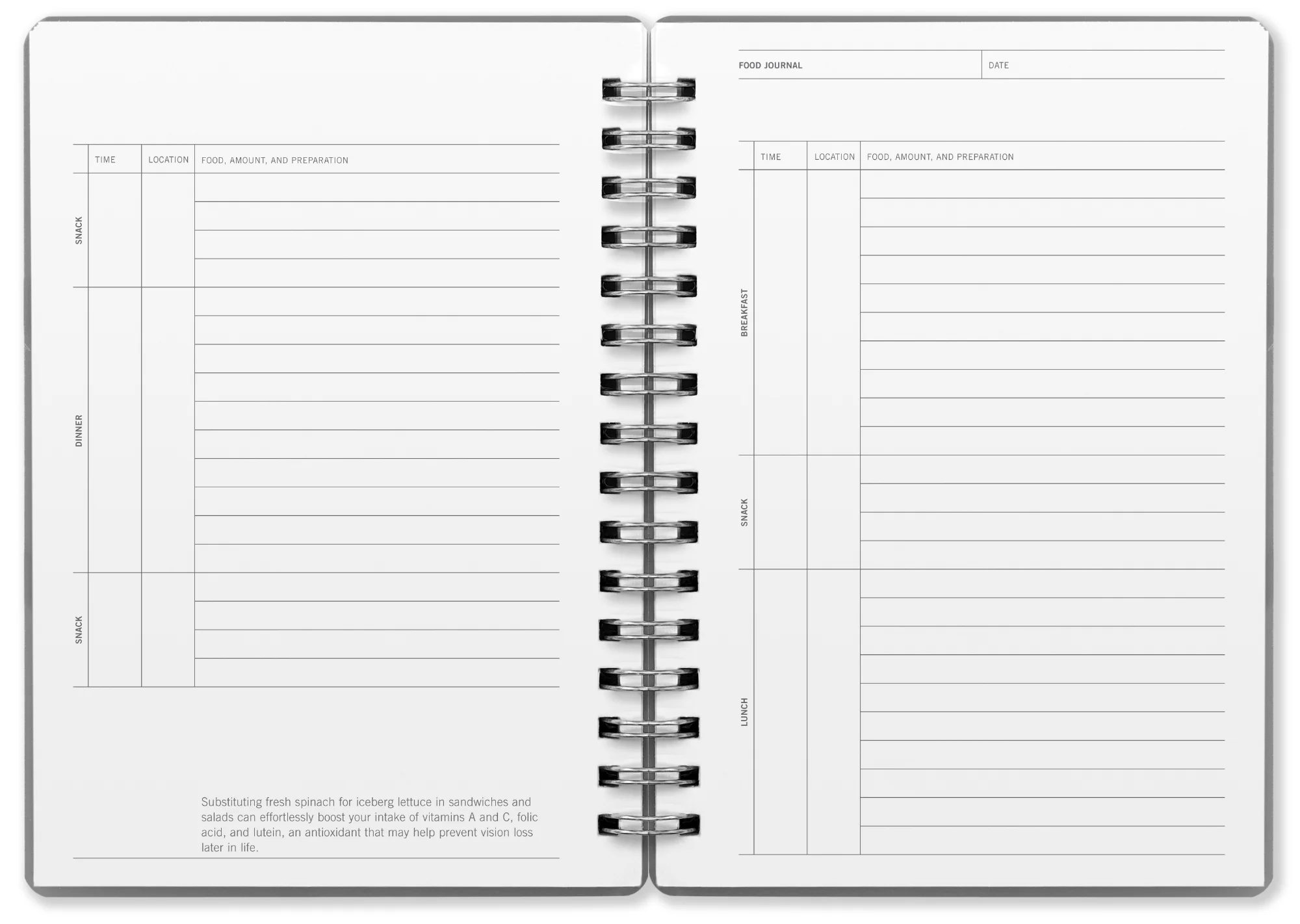
Serving as an oasis in the midst of New York City, CLAY was a new hybrid of health club and spa that offered a comprehensive and holistic approach to health and wellness. The name CLAY took its inspiration from the idea of molding and shaping and the potential for transformation. 

The project brief was to develop a resonant brand identity that would reflect the modern, organic nature of CLAY. We worked closely with the client on a wide range of projects including environmental branding, advertising and marketing initiatives, PR strategy, the development of a private-label product line, and even curated a music collection of over 5,000 tracks on their behalf—categorizing multiple playlists according to tempo and time of day.

In collaboration with Heather Ungruhe (writer) and Scott Mitchem (Office in Concept cofounder).


VISUAL IDENTITY


CLAY_VisualID_Logo.png
CLAY_VisualID_Color.png
Trade Gothic Bold 2

Trade Gothic Bold 2

Trade Gothic Light

Trade Gothic Light


Business cards (landscape photography by Nicholas Pavloff)

Business cards (landscape photography by Nicholas Pavloff)


Letterhead


Envelope

Envelope


Marketing


philosophy

Our Temple for Yours Within the body, an intricate network of systems function concurrently, harmoniously sustaining life. CLAY introduces a similarly integrated program, offered in a refined environment equipped with full amenities. Dedicated to supporting each member’s individual pursuit of health, our approach seamlessly unites physical training, mindful exercise, and nutritional guidance. The result is a complete fitness experience, with diverse options and personalized care extending far beyond that found in a conventional gym environment. Your body is your temple. We’ll teach you how to treat it like one.


membership brochure


Interior photography by Doug Fogelson


NUTRITIONAL HANDBOOK


PRIVATE LABEL PRODUCT PACKAGING

 
CLAY_product.jpg
 

ECOMMERCE SITE

 
CLAY_web2_low.jpg